This is my story of redesigning ‘CCS+’—a desktop and mobile app that empowers United Airlines' pilots to manage their busy schedules.
This project took place between May 2024 and December 2025. I worked on this project as a UI/UX Engineer/Designer for the IUX team at United Airlines.
I was part of a team that worked alongside Business Analysts, Angular Software Developers, and Project Managers. I was responsible for designing journey maps, process flows, wireframes, and a design system before progressing to high-fidelity UI and interactive prototypes for ‘CCS+’–an internal software application for United’s pilots.
United's Pilot union and IT management approached us to help them redesign their outdated scheduling application into a modern, user-friendly responsive web application. Our team focused on envisioning and delivering an application that would transform pilots' busy work lives in an effective and meaningful way.
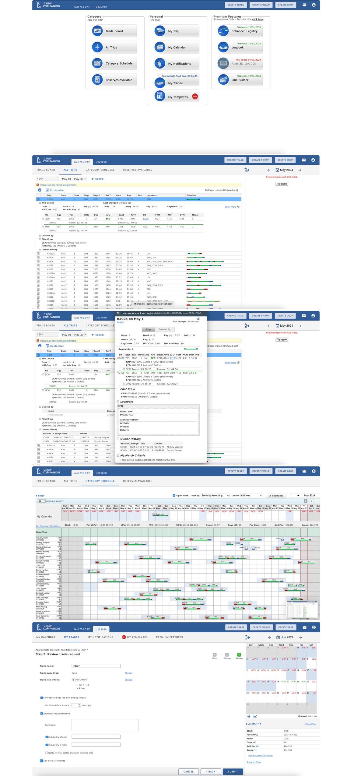
Old CCS+ (Crew Companion) App
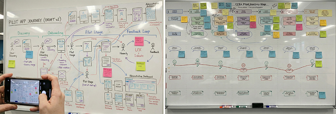
Every big part of the project started from the whiteboarding sessions in our UX lab. Designers, developers and project managers got together to discuss user profiles, features, goals, and the way to solve the design problems.
The Agile development process required working on separate features and providing the final result every two weeks (each sprint). We needed to incorporate the new design patterns into the old product, keeping it consistent and easy to use. On this stage, the constant collaboration with product managers and developers was important to make sure we were always aligned with the business and technical requirements.
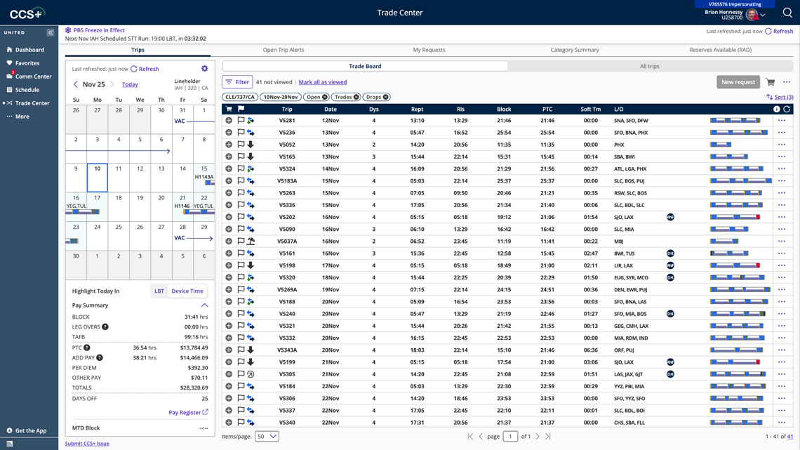
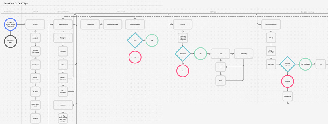
Defining the right user flows was one of the most important parts of the design process. The complexity of the product required creating user flows for every major feature. Some processes required sending email notifications or signing in to third party services. The most effective way to define and show the flows was to use low-fidelity wireframes with connections between pages and the particular elements of the interface.
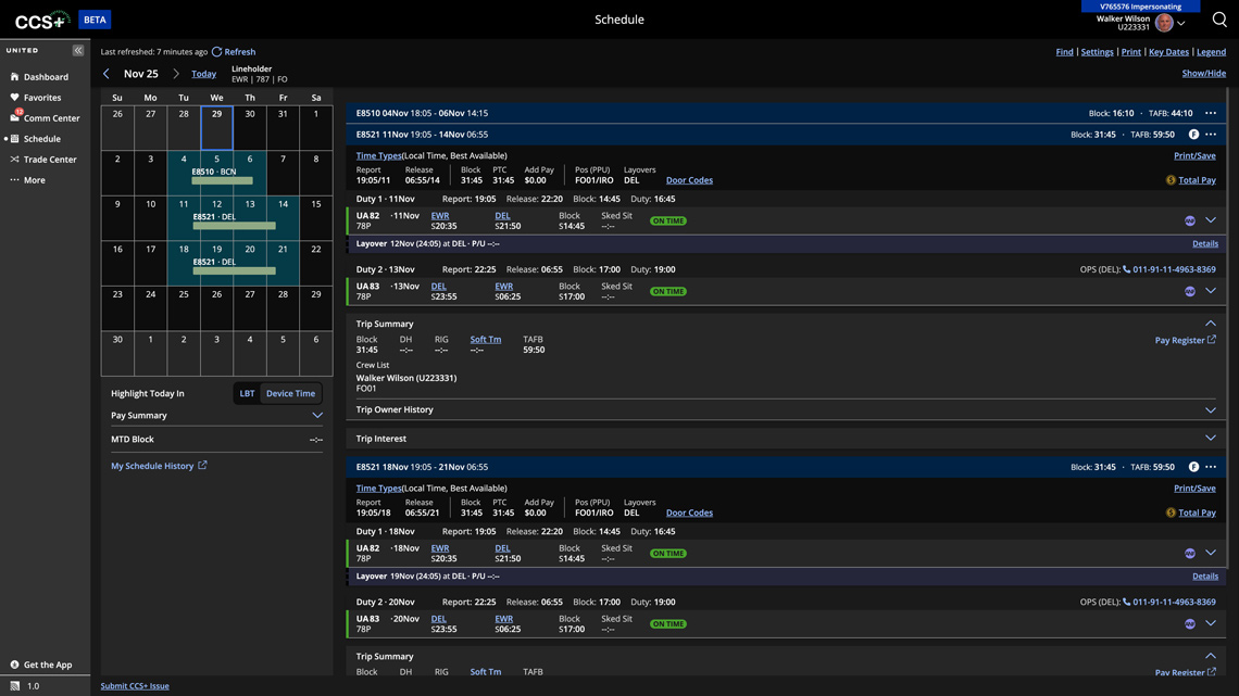
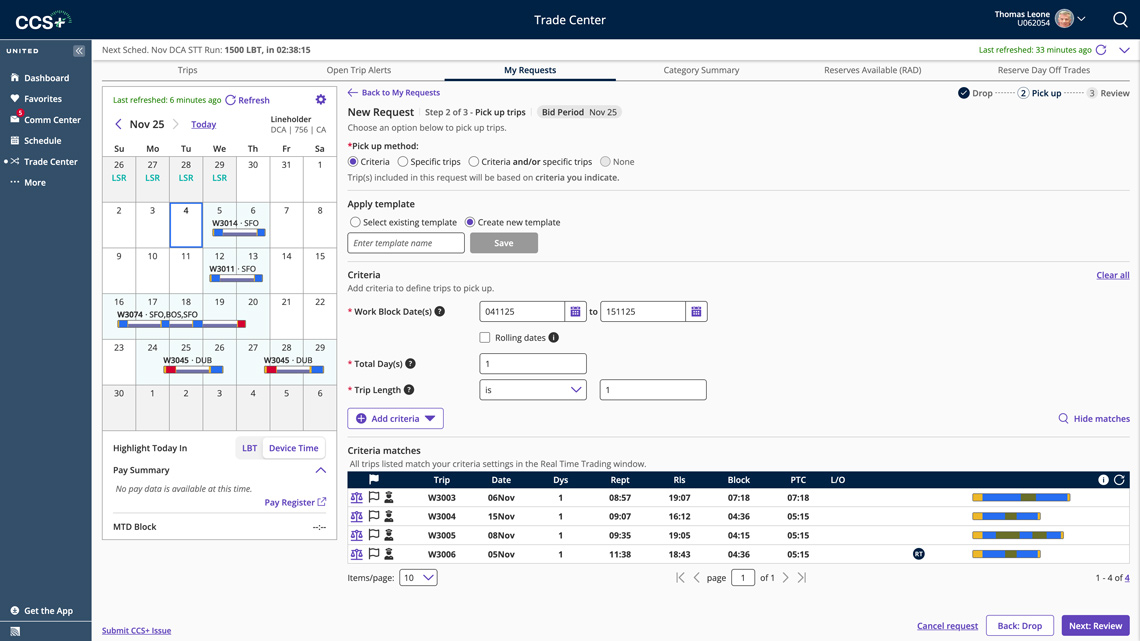
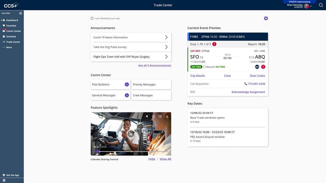
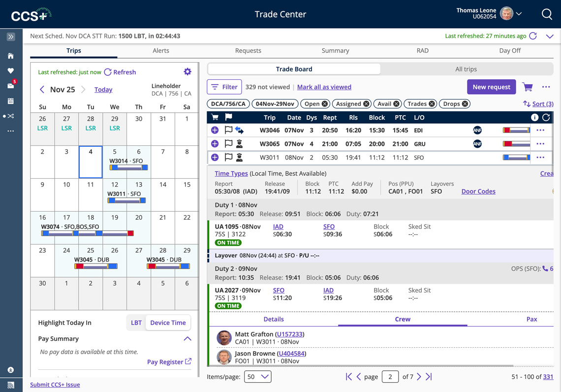
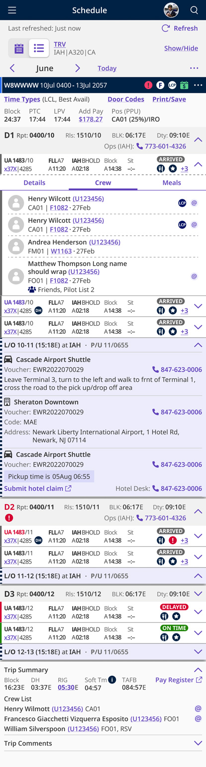
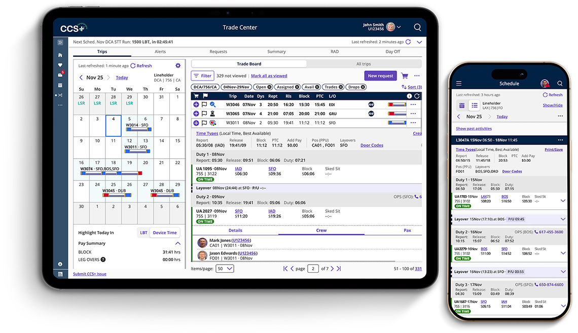
The new app was built from the ground up. Special attention was given to the consistency of the UI and UX interactions. To maintain the consistency, my team leveraged the UI design system, adding the new elements to it from time to time. For one of the most used patterns in the trip trade grid, I created a reusable design template, which helped to create new pages very quickly. A dark mode version was also created because pilots often fly at night and prefer a dark visual screen.